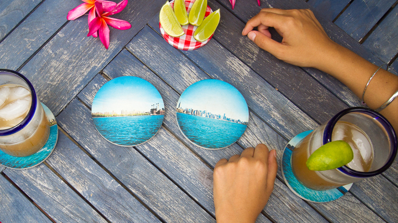
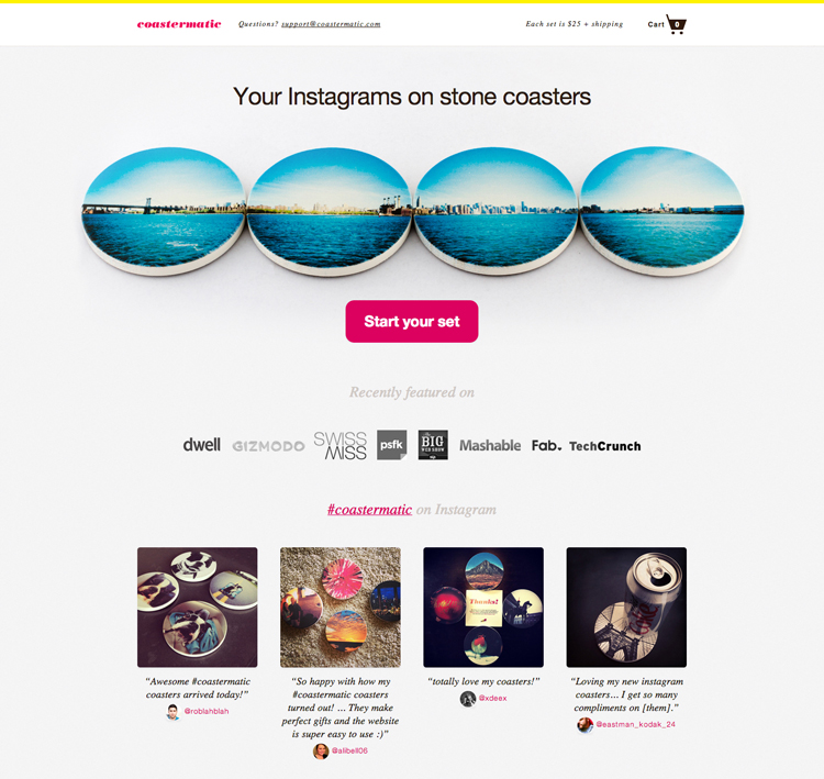
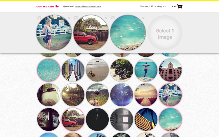
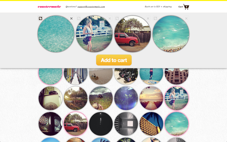
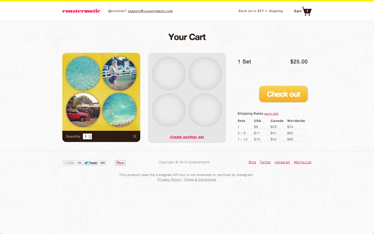
A web/manufacturing service that turns your Instagram photos into stone coasters.
The project began as an MFA collaboration with Tash Wong as an experiment in Customer Acquisition and Minimum Viable Product. Early success validated our assumptions, allowing us to continue growing the company alongside our MFA commitments. Upon graduation we both focused full-time on product growth.
I think there’s a lot of exciting possibilities around making technology more human in the home and Coastermatic represents an exploration of this landscape in the form of a mass-consumer product.
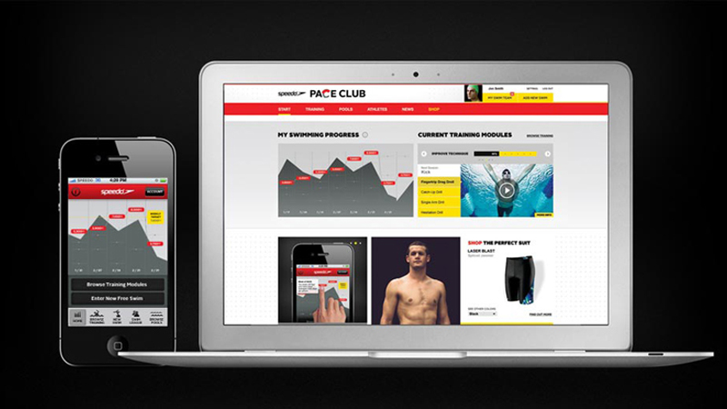
Speedo USA's swim community & training platform, for iPhone & web.
Speedo’s ambition was simple: to encourage more people to get in the pool, by making swimming more fun. Initial conversations revolved around the problem of capturing swim data, without investing up-front in a dedicated device required to do so. After research across a range of swim personas we decided to focus on the competitive and social aspects of the product. This allowed Speedo to launch early and iterate rapidly, cultivating a strong community of early adopters. Insights gleamed from these real interactions could then be folded into refining and adding features as the product developed.
The challenge component converts personal swimming goals into social objects, allowing friendly competition between acquaintances. You might be racing someone who trains in the same pool as you, or a close-friend who lives overseas. This social accountability piece proved incredibly powerful at motivating users to return to the pool. A side effect of this was the encouragement to manually capture swim data, providing Speedo with valuable insights for developing their potential physical swim tracker of the future.
The project was an international phenomenon with 65,000 entrants, uploading over 500,000 photos in 36 days. The site delivered 56 million page views.
Deliverables
Early in the process my role focused on developing strategies toward cultivating community engagement. This involved encouraging creativity and positive interaction between users while still meeting Benetton's competition criteria. As the project progressed and strategies were chosen, the bulk of my role turned to one of fleshing out the user experience through wireframes and communicating these decisions across engineering and visual design teams.
Process
The following is taken from a blog post I wrote in Mar 2010:
Following the recent launch of IT'S MY TIME for Benetton, I wanted to give a little insight into our UX process with snippets from our approach and how we've tried to apply this thinking to IT'S MY TIME. I'll start with the obvious...
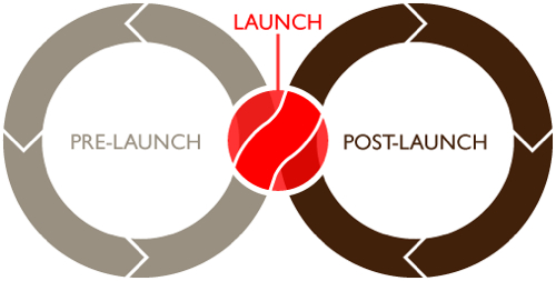
There are two very distinct phases to UX design:
Pre-launch: Prediction
Entirely based on lessons learnt from previous projects, assumptions on traffic, types of user behavior we're looking to encourage and the type of community we're looking to harbour. User testing plays a crucial role in getting early feedback, but it's impossible to tell exactly what problems may arise or what features are lacking until the site is out in the wild. Crucial structural decisions, such as how users will interact with each other, or editorial content, are made at this stage.
Post-launch: Evolution
The site goes live and 50 people sign up. The next minute there are 5,000 and you're designing by the seat of your pants, patching up holes as design flaws appear or a clear need for features become apparent. Quick uptake is a great problem to have but can also have technical implications which require further UX consideration. The beauty of designing for the web is the ability to make small changes and tweaks to perfect the user experience. However, there is no going back on big structural decisions, so we have to hope we nailed them before going live. Due to the short length of the project - only 5 weeks - we steered toward a more prediction-heavy design approach. Here's an overview of what we were hoping to achieve and how that turned out in reality.
Pre-launch: Applying a metaphor
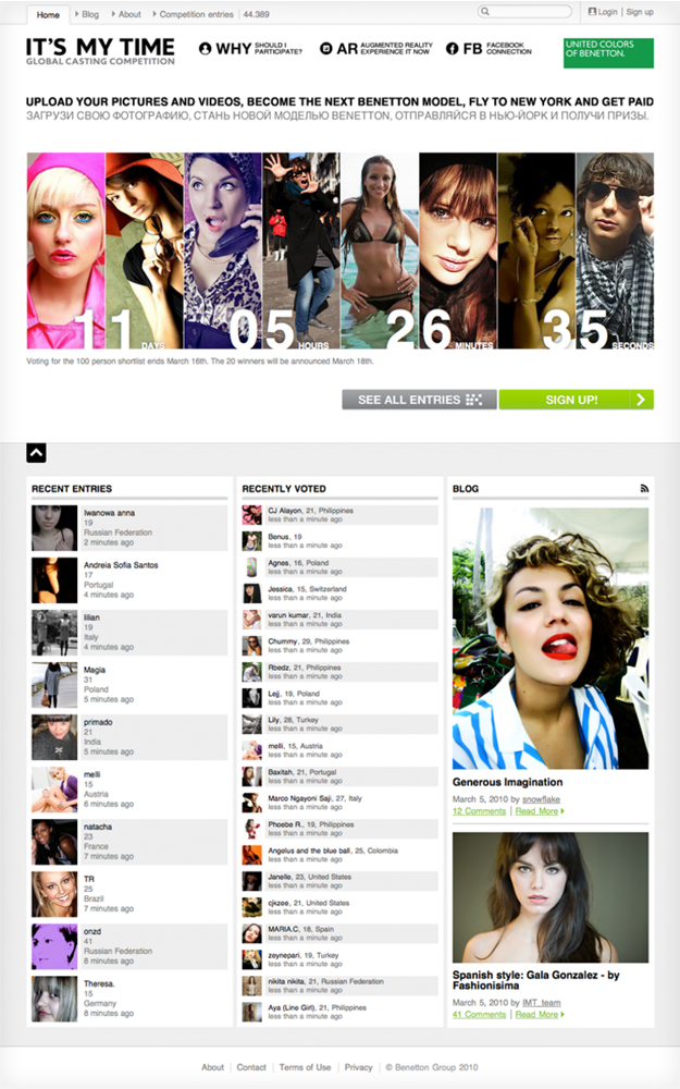
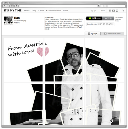
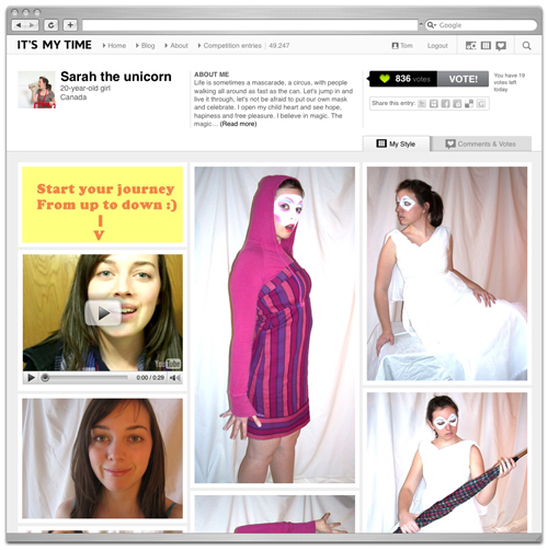
As with any design approach, having a theme or a vision you're working towards helps the smaller details fall into place. From the start, we wanted to incorporate the clock concept but forcing users to upload specific "time themed" content felt like it raised the barrier to entry too high and reduced flexibility too much. So, we needed a more versatile metaphor to align the user experience with. The whole campaign is aimed at re-visioning how Benetton casts its models, so, we decided to use the catalogue as the core element to base user interactions on. We wanted users to create their own pages of what could collectively turn out to be a user-generated catalog. Inspired by sites such as muxtape.com and lookbook.nu, we set about tackling the core problem of allowing exciting personalities to shine through, rather than the site being just a photo collection of beautiful people.
1. Encourage Participation
We wanted to give users value for just using the site, rather than relying on social interactions to make it compelling. The vision was to create a physical, printed catalogue made up by the pages (or profiles) of the shortlisted users. We hoped this would provide incentive to create captivating pages rather than simply uploading nice photographs. We hoped the element of tangibility would add depth and imagination to user motivation.
2. Encourage Creativity
Creativity is at the heart of what Benetton were looking for in their models. The catalogue page metaphor fitted perfectly here, providing a blank canvas for more motivated users to take advantage of. They could upload photos of videos of various elements of their lives and personality to create a page that really shines. At the same time, we weren't excluding the beautiful but boring, who simply want to upload their modelling shots and not return to the site until the finalists are announced.
3. Allow for Flexibility
The design and build schedule was very tight and the competition structure fairly loose, so we needed to make progress but still have enough room to maneuver if there were legal issues or problems that arose from user testing. This was particularly important when competition rules kept fluctuating betwen Users must upload 4 photos and a video to Users can upload as much or as little as they want and shouldn't be limited.
At launch
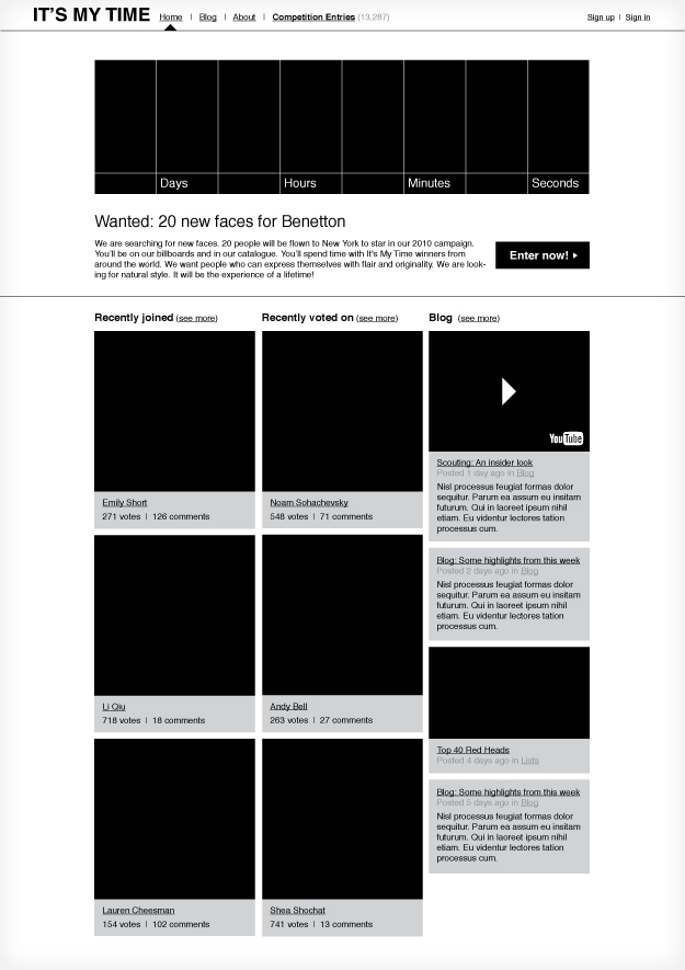
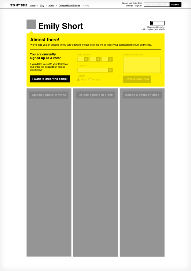
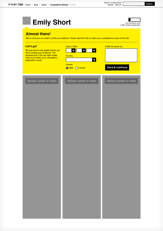
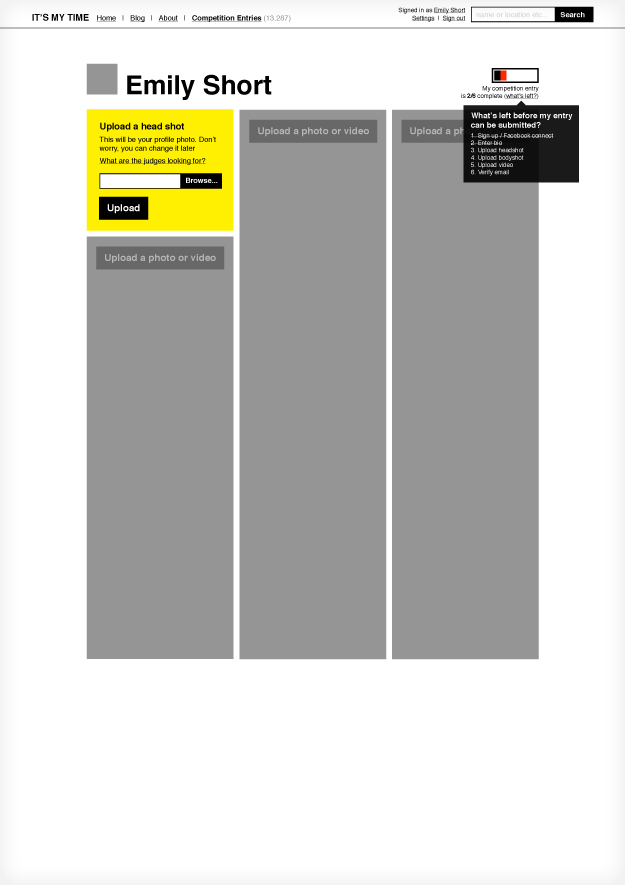
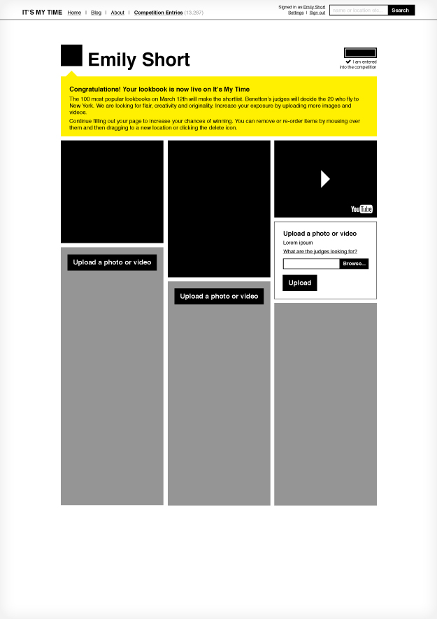
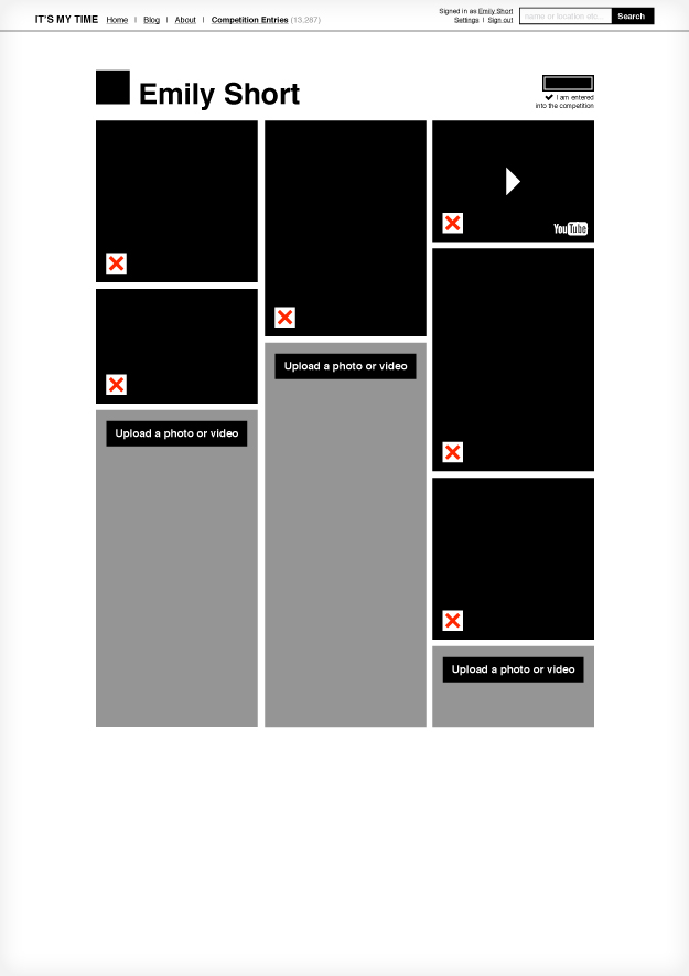
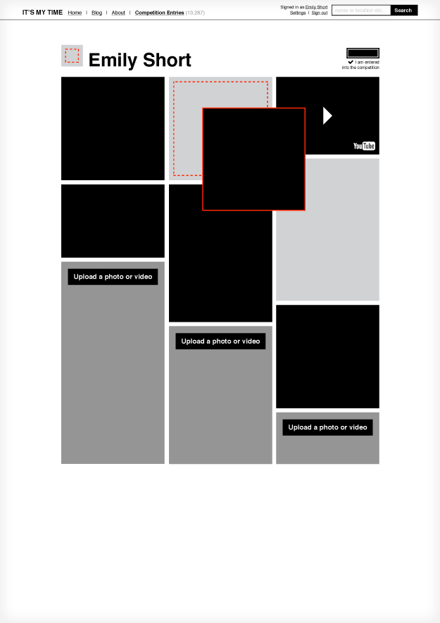
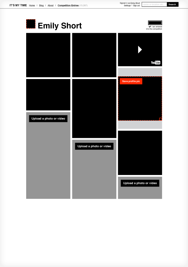
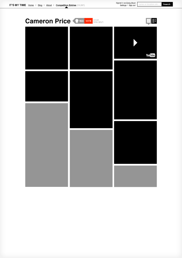
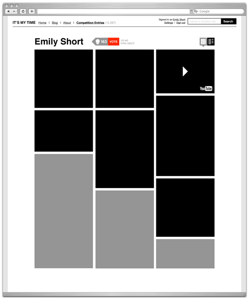
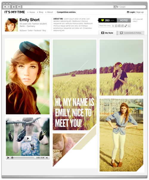
After refinement and user testing, we felt we had a strong solution so we started applying visual design. The structure was flexible enough to incorporate last minute user testing feedback, such as going from 3 votes to 20 votes and only requiring users upload 1 image or video. Here's how the design of the profile page developed from a wireframe and an example of how we were hoping users would get creative with their profile:
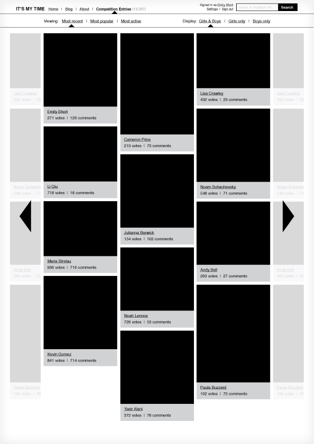
The site received tremendous traffic. We saw over a million comments between users in the first week alone. The homepage was designed to highlight those who had recently signed up, cultivating a lovely welcoming interaction where existing users would meet and greet new users. Unfortunately, the early success of the site lead to a couple of UX problems:
Capacity issues
The sheer volume of users uploading photos meant our servers couldn't keep up. Thanks to some excellent quick thinking by the tech team, we rapidly increased capacity, but we also required a bunch of new UI assets for 'processing' avatars and to encourage users to upload smaller files along with other small tweaks to the core user flows.
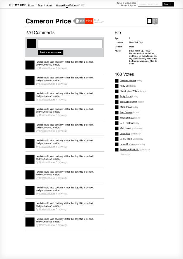
Comment spam
After about day 3, users started to realise how to play the game and the notion of vote for vote began. This is when a user posts a comment saying "Vote for me and I'll vote you back", which is OK once in a while, but new users would get a barrage of 20-40 comments within half an hour of signing up. Users would copy and paste this to all profiles they could find in order to obtain the all-powerful votes. Although we didn't make any changes to the design, we limited users to one comment every 60 seconds and encouraged the editorial team to make a big effort to highlight users who were playing the game fairly.
Conclusion
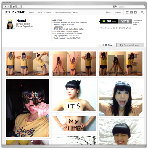
Despite a few minor setbacks, IT'S MY TIME has been a great success. The catalogue concept mapped very neatly onto an online environment. The interactions and relationships between users have been fascinating to watch as they evolved. My favorite thing about this project has been seeing how many people got creative with the profile format. In a tribute to their resourcefulness I'll leave you with these 3 masterpieces.
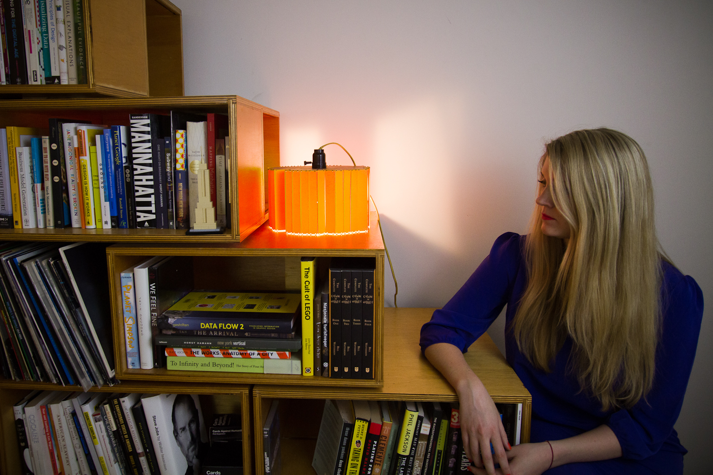
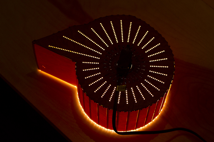
The light of your life. When physical products come from personal data.
For most of us, clutter is something we’d rather cut out. Just look at the way iPods wiped out CD racks and Kindles gave cobwebs to bookshelves. It’s these technologies that are building a slicker, more personal story for each and every one of us – making the physical objects we use every day more meaningful to our lives.
Figuros does just that. It was made to explore the way we consume possessions and make the ones we do, more meaningful. So don’t be surprised when your friends’ first response is, “it’s so you”.
Process
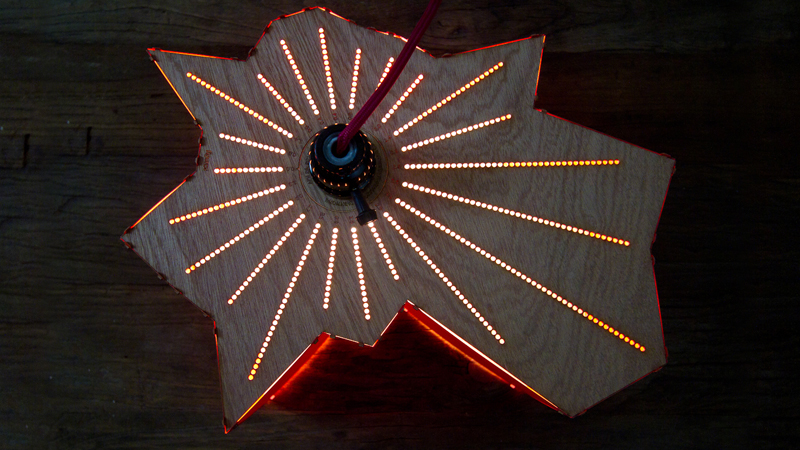
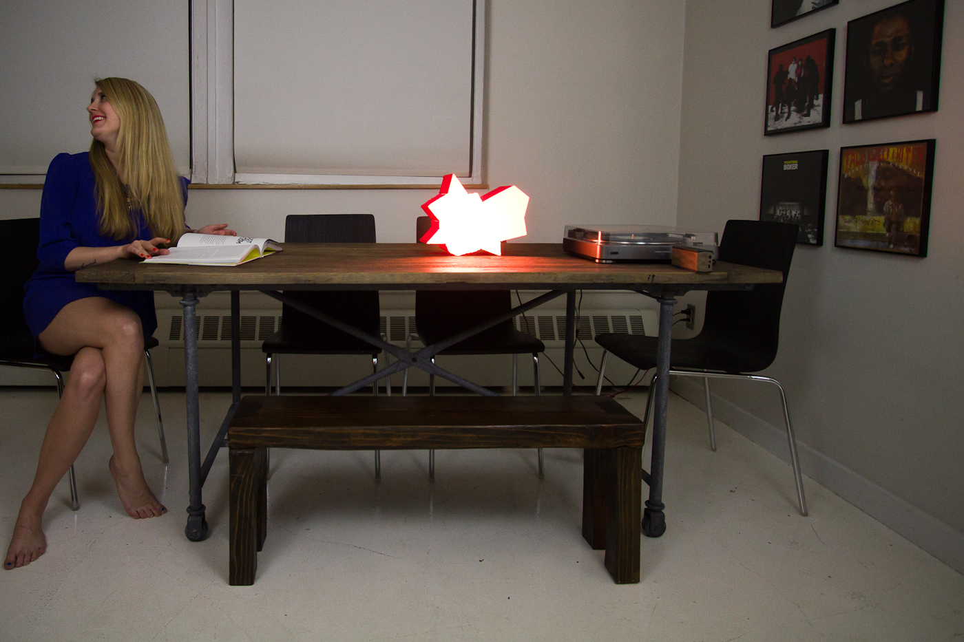
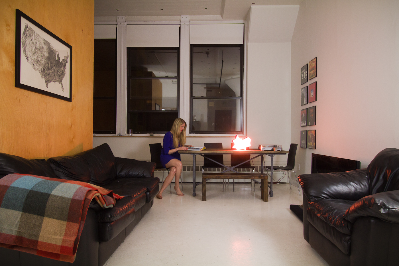
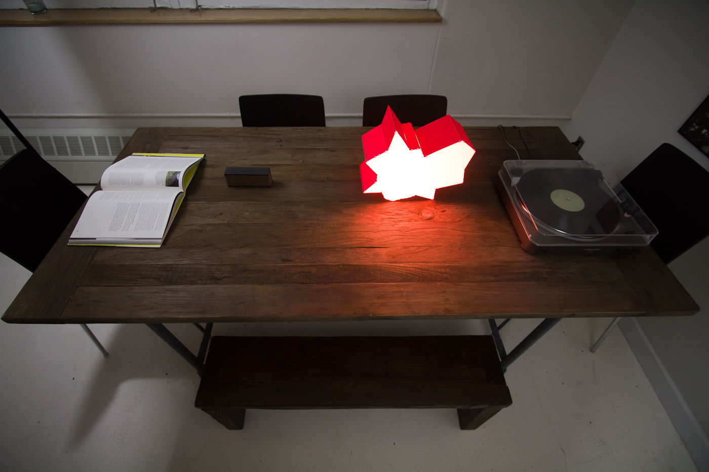
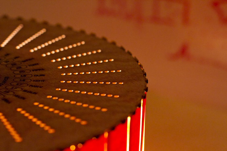
v1. Lampshade of Listening Habits
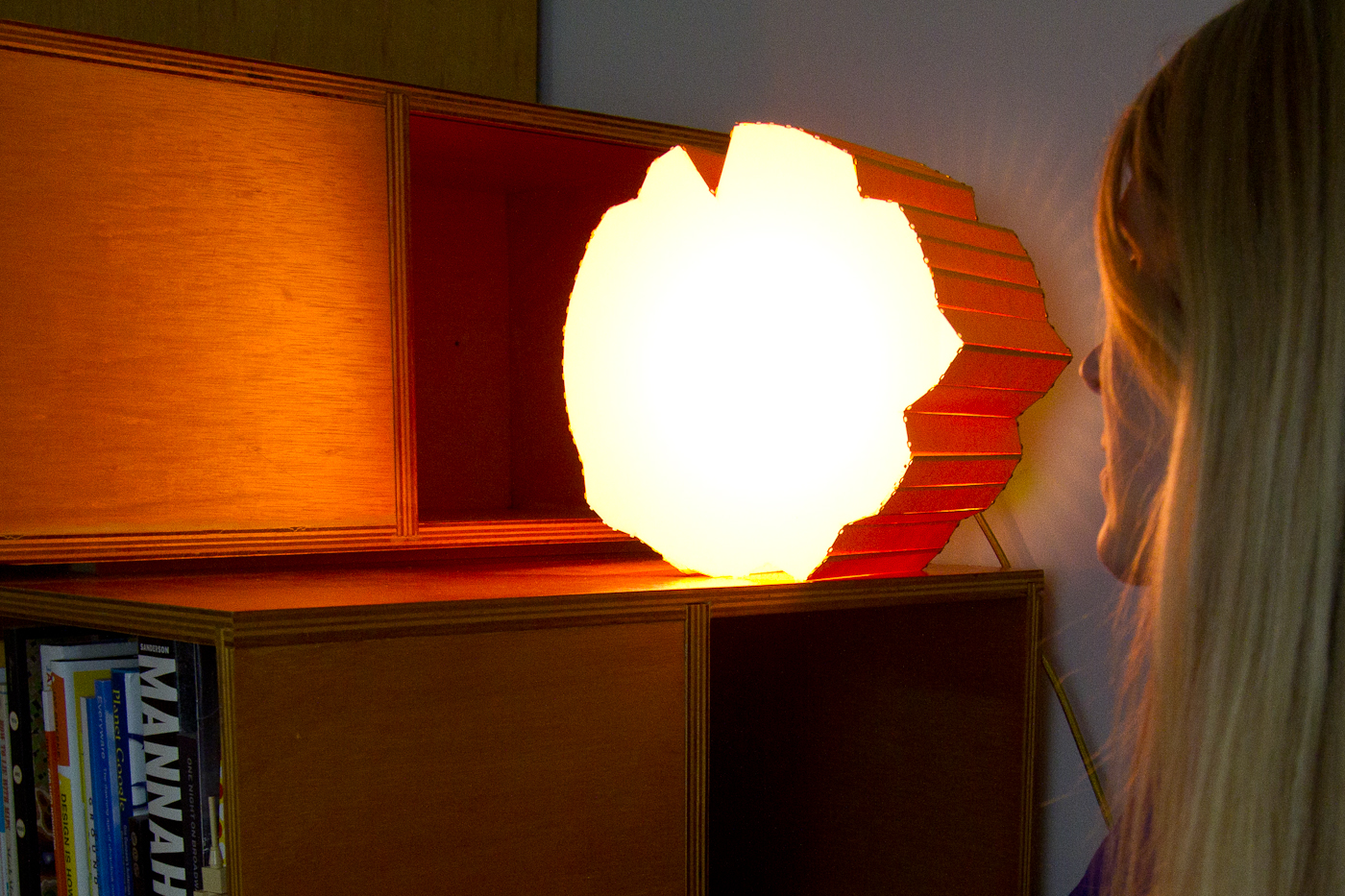
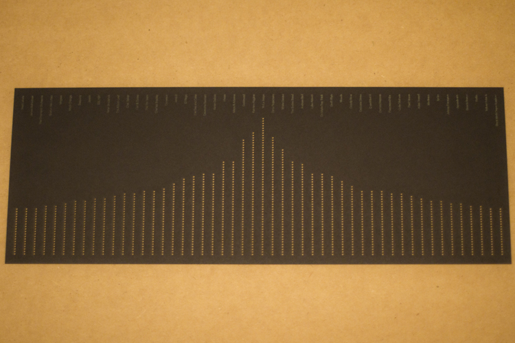
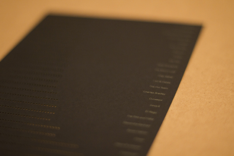
As literature, music and film transition from physical objects to digital on-demand services, how might we consider translating the self-expression these objects represent back into our physical environments?
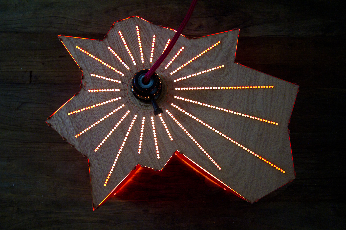
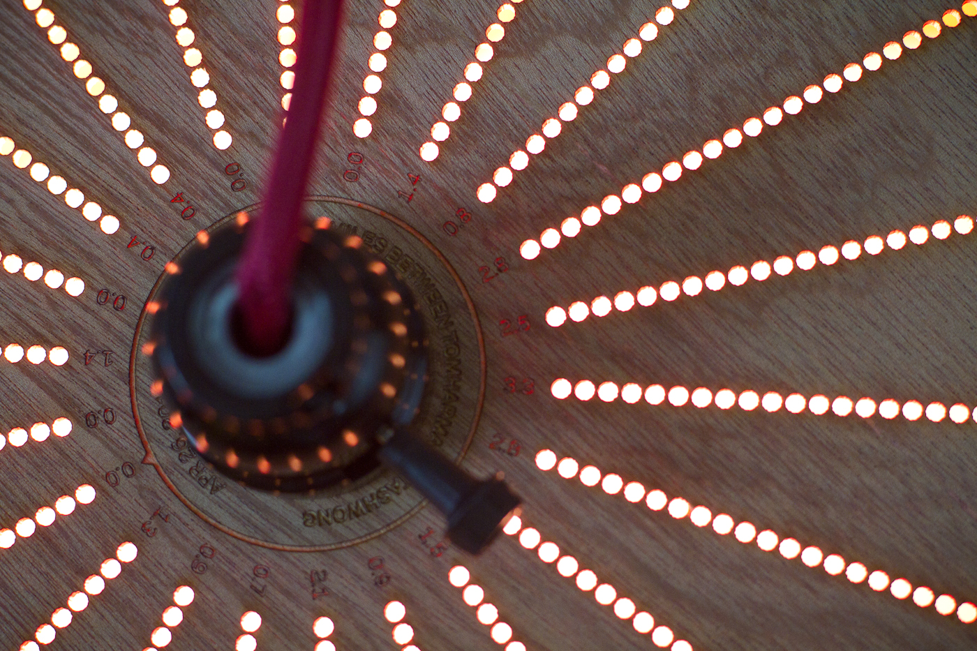
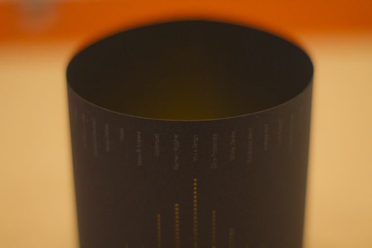
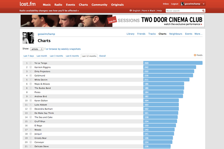
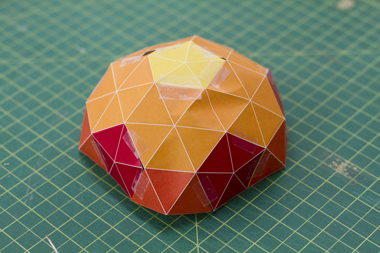
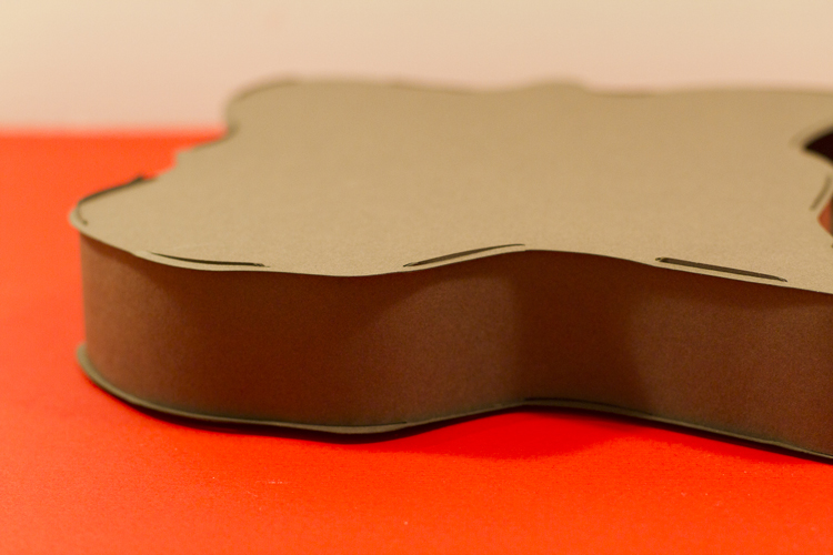
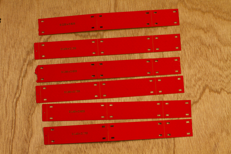
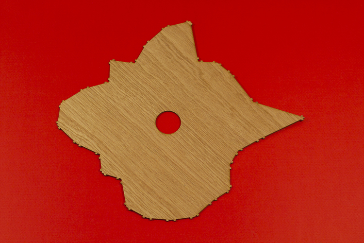
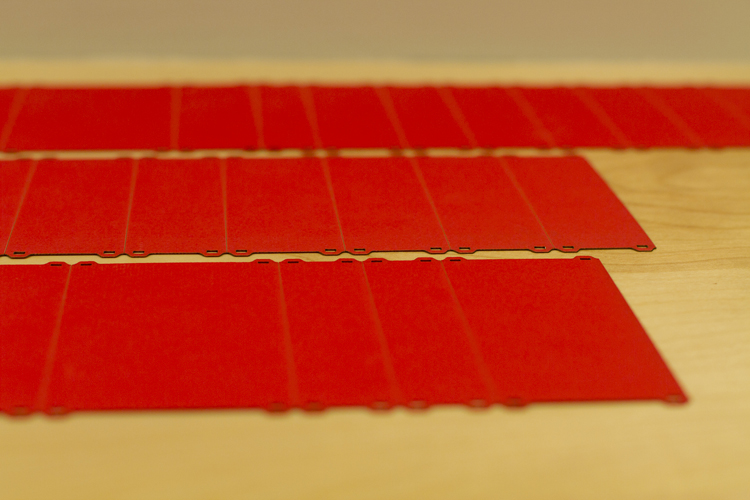
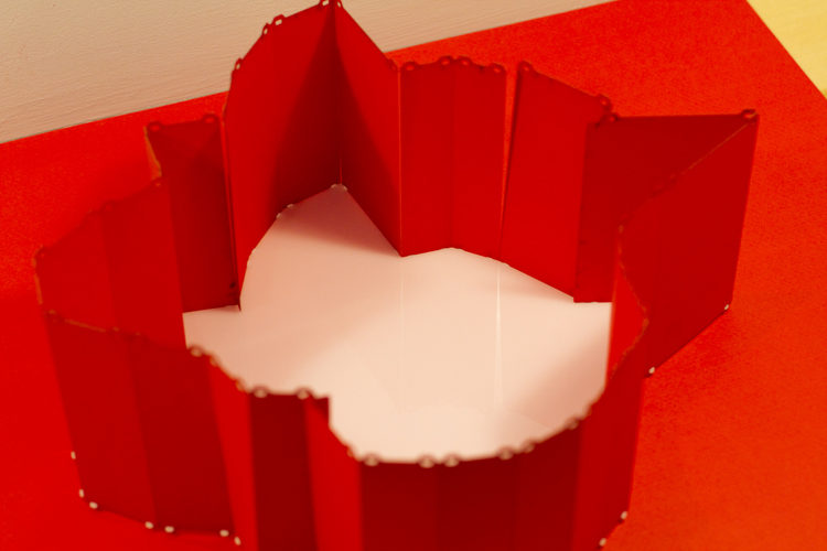
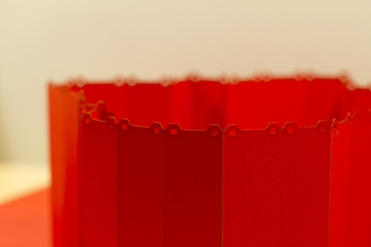
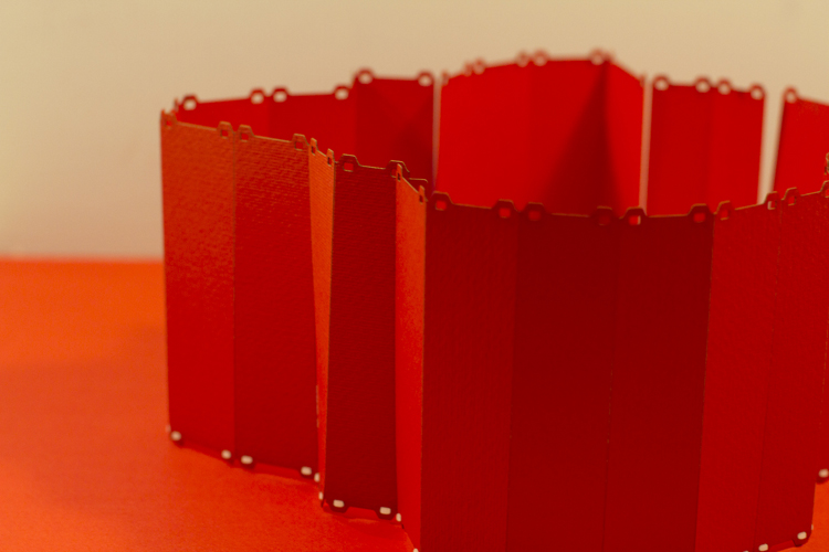
The lampshade incorporates laser-cut holes determined by personal listening habits, determined by last.fm listening data throughout 2012. The idea being that the final form is unique to the individual who creates it. The top 50 artists make up each column, the height of which is determined by the relative number of listens.
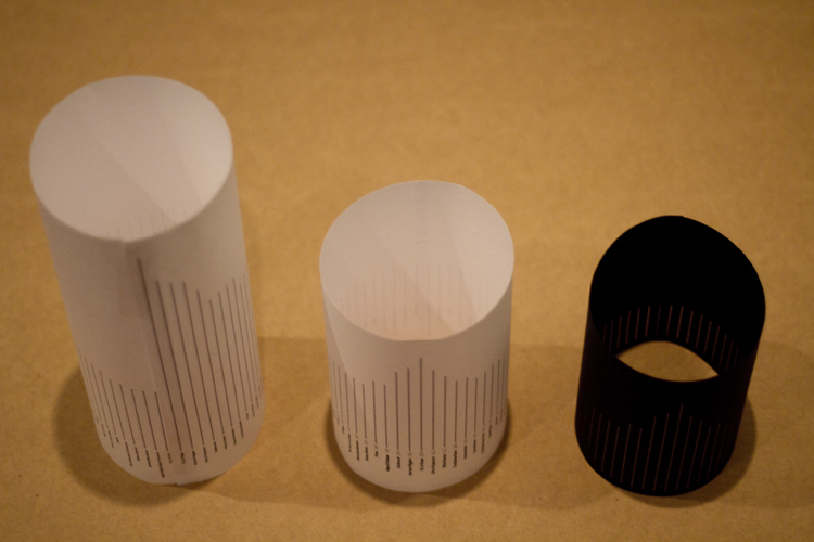
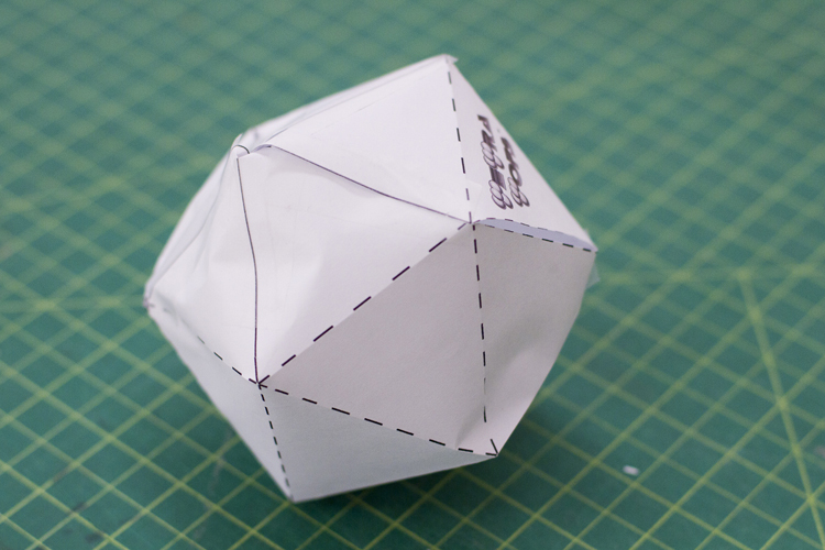
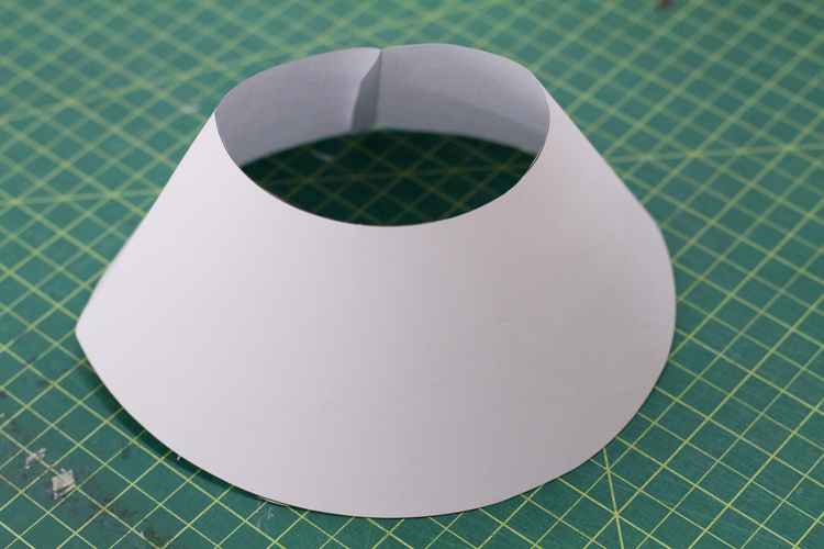
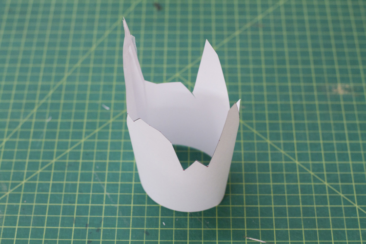
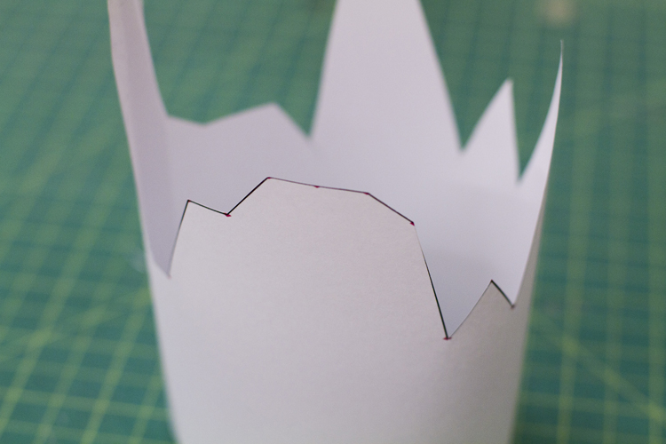
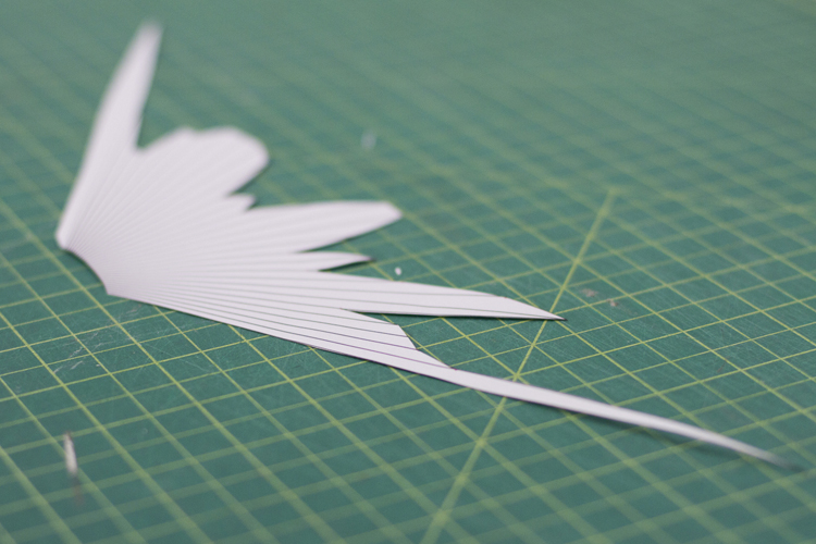
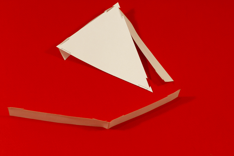
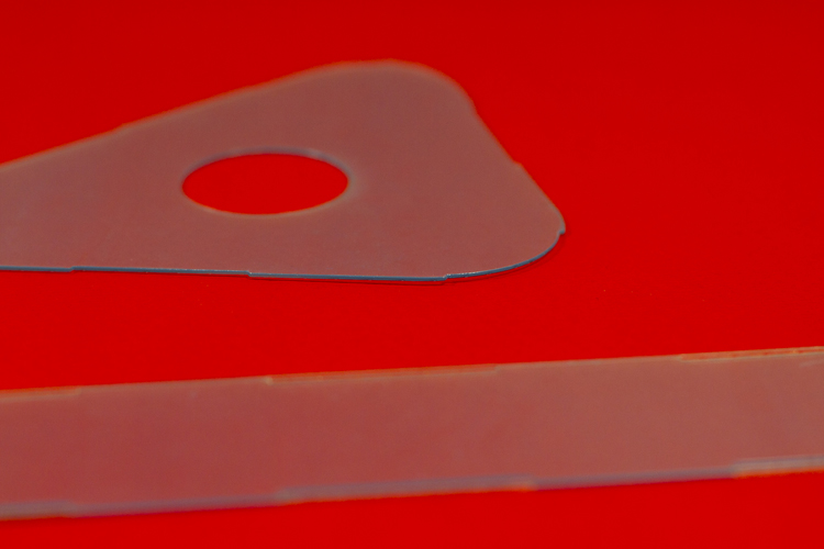
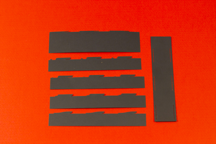
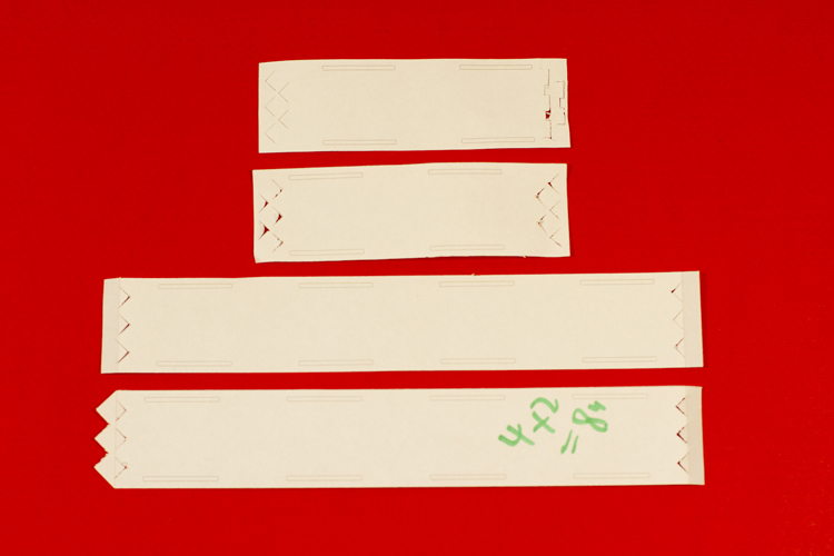
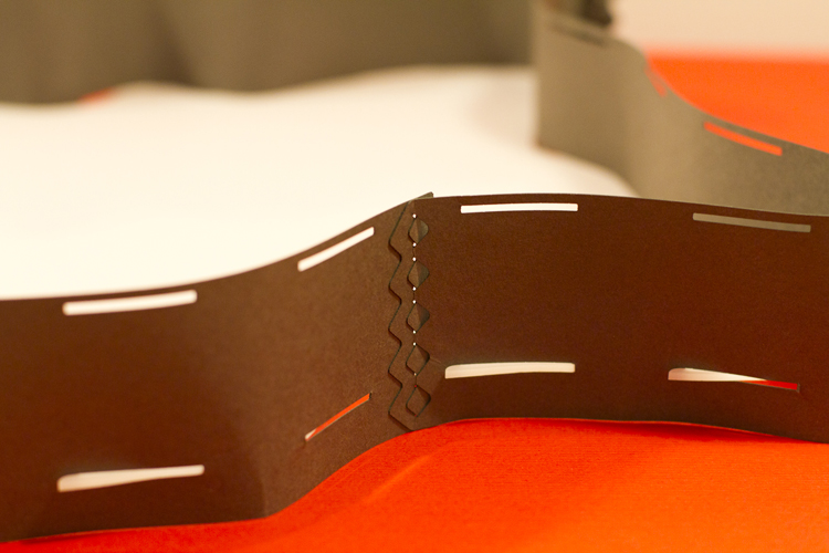
Paper Prototyping
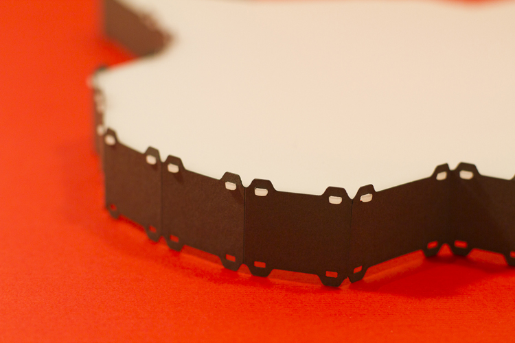
I carried out various explorations into possible lampshade forms. Key criteria involved the shape being reproducible using digital fabrication techniques as well as being adaptable based on specific user-determined criteria.
After settling on a form and production technique (lasercutting), I explored various assembly methods to create a robust yet versatile object.
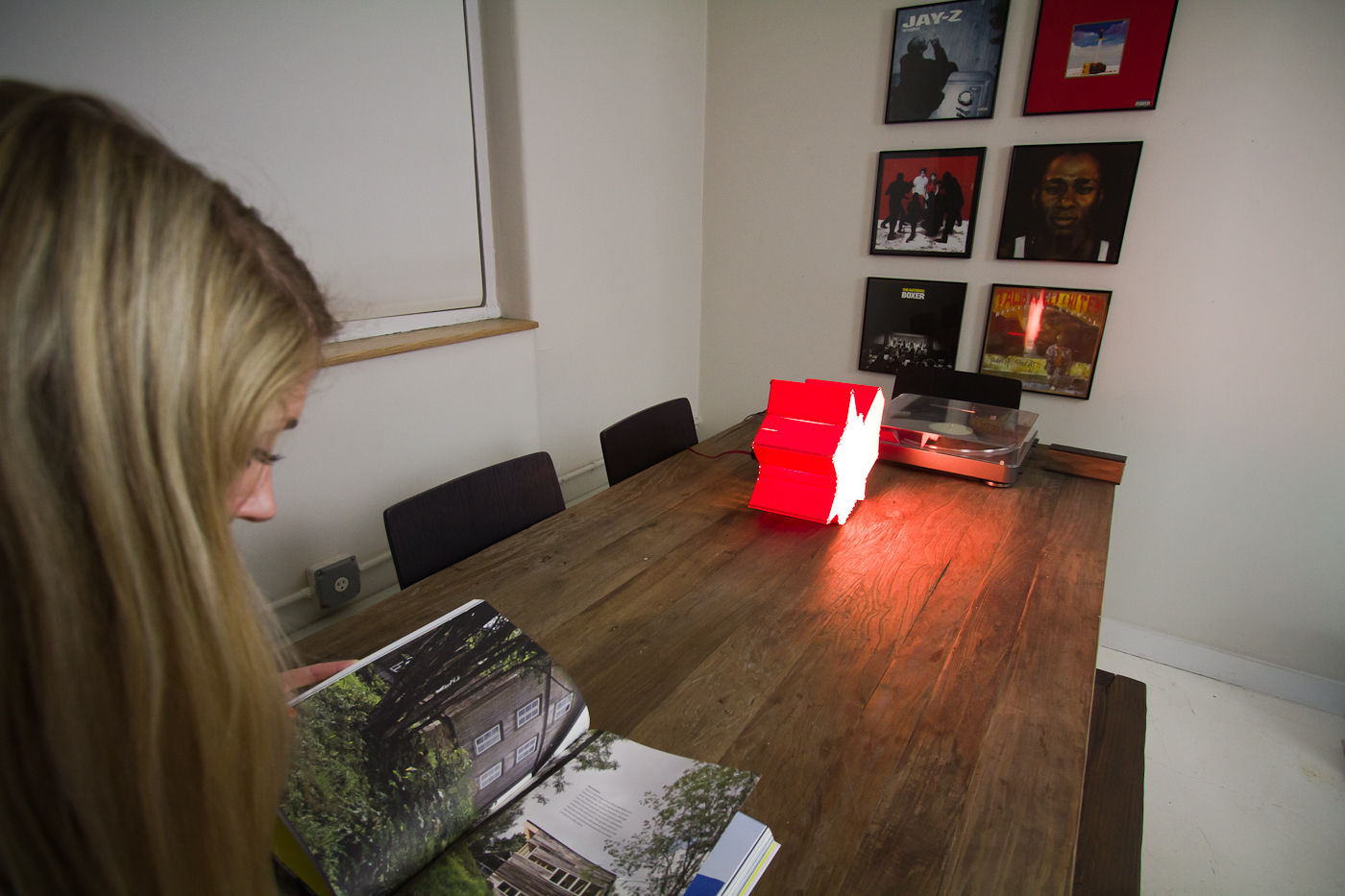
v2. Alcohol & Gchat
Having wrapped up my physical production framework I set about exploring data-to-physical translations that would generate personal objects based on everyday interactions. I started by exploring self-tracked data sources, the first result was based on my personal alcohol consumption during February 2013:
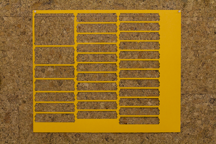
After manually creating an algorithm to perform the translation of quantity-over-time onto an extruded radar plot I started writing code to perform the same functionality based on vaious APIs. This is my entire GChat history since 2005:
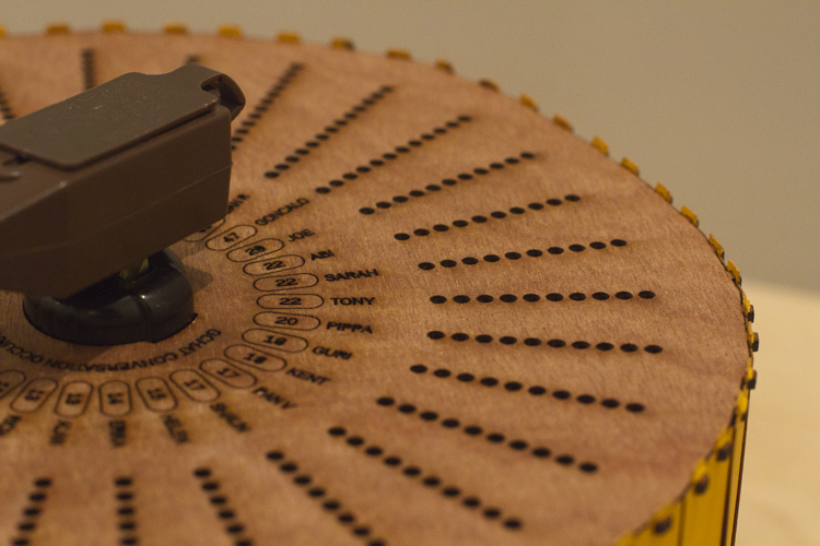
With this code in place the final challenge was to find meaningful insight into a data source that most people interact with on a daily basis. I settled on the distance between two people over time, based on geo-tagged Instagram images. I built a digital prototype which generates lasercut files based on this criteria, so people who see a lot of each other have a very different shape to those far away.
A platform bringing together consumers, makers, and manufacturers to enable creative reuses for unwanted technology.
Makers share creative reuse ideas to a broad community. In turn, the community helps realize maker-ideas: consumers donate technology otherwise bound for the global waste-stream and manufacturers fund packaging, shipping, and handling as an opportunity to practice corporate social responsibility.
The project was completed as part of GOOD Magazine’s design hackathon, where we spent 24 hours thinking up and designing the concept. We’re fortunate to have won the Best in Show award for our efforts.
Deliverables
I was primarily responsible for creating the following:
Process
Due to the extreme time-constraint we spent our first hour brainstorming before quickly settling on a direction and set of deliverables that would suit our collective skillsets. The remainder of the process is best illustrated in the following video:
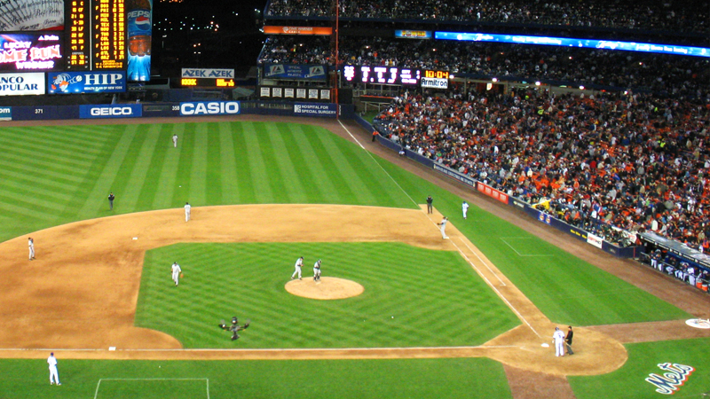
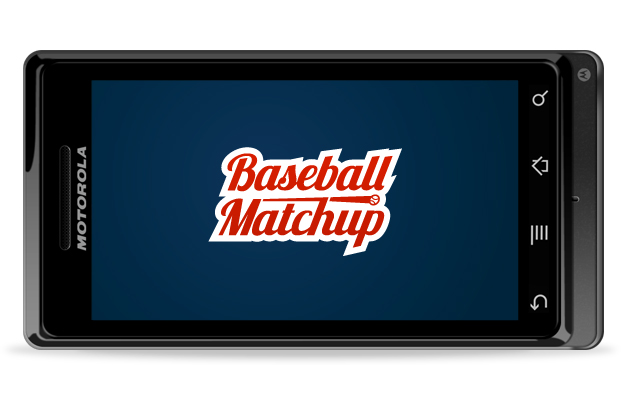
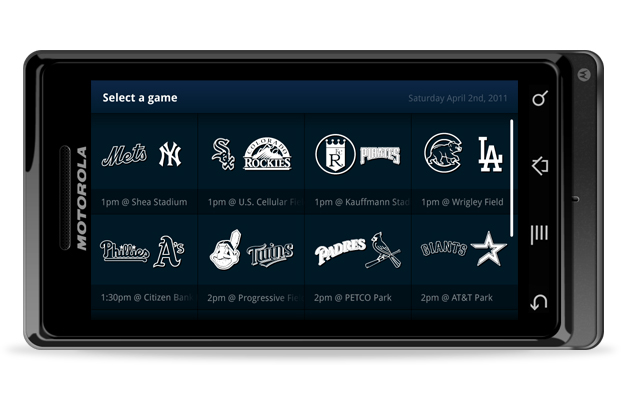
Making sense of the stats, live from your seat at the stadium.
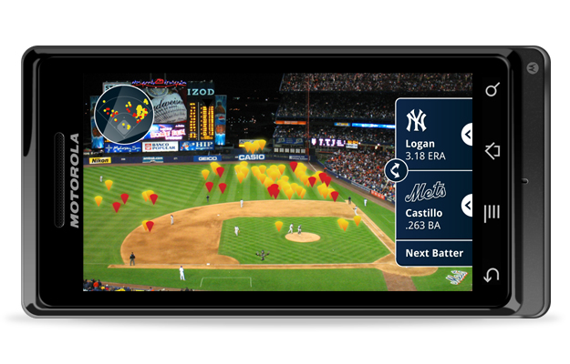
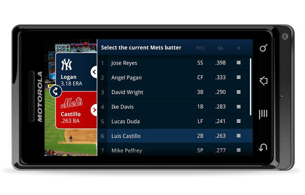
Baseball Matchup leverages data from previous pitcher & batter matchups to show the locations of hits, live on the field, using augmented reality. Gain insight into why the outfield changes position as the next player steps up. Notice gaps the fielders haven’t spotted. Understand why certain batters struggle against particular pitchers.
It's designed for any baseball fan attending an MLB game. Baseball Matchup will help novices learn what to expect while providing a deeper level of insight for the experienced fan.
Data visualization and analysis of baseball has been on our TV screens for decades. Baseball Matchup takes this to the next level, away from the sofa and direct to your seat in the stadium.
Deliverables
Process
The following is taken from a blog post I wrote in Nov 2010:
Having lived in the US for about a year now, it felt about time I started learning a little about the fundamentals of American sport. A New York brainstorm topic, 'Enhancing sporting events through mobile', led Mr. Corrigan to step up to the plate with an exciting germ of an idea named 'batting scope'. A promising concept and an excuse to learn the rules of baseball? How could I not develop this idea?!
Sketches
After a few initial pages of notes, I came to the realisation that creating a truly worthwhile experience would require a much deeper understanding of baseball fan culture; not just the rules. I quizzed Cameron on and off for a week or so with questions about what stats in baseball are most compelling and why particular players or rivalries are significant. I learned some key things:
The relationship between pitcher and batter at specific times during the game has a huge impact on the outcome of a pitch. (i.e. Whether the batter will even try to hit it)
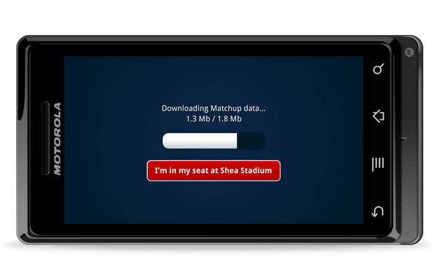
There is no chance of getting a decent data connection at Yankee stadium.
There are more stats available in baseball than any other sport I've seen.
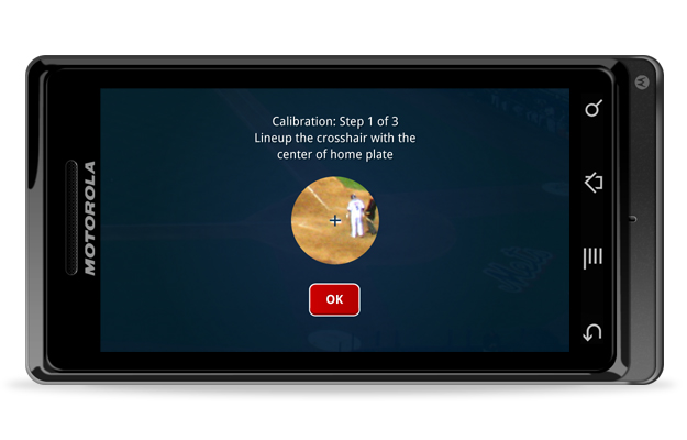
Some seats have much better visibility than others. How can the app cater to all?
The app will need a lot of setting up before it can be useful.
I've never used an Android phone before.
Before doing anything else, I needed to borrow a Droid for the week, install every app I could find and live as much as possible with the device. There were a ton of insights I learned in terms of UI conventions but the most significant was deciding on the orientation people would need to hold their phone. Rendering the app horizontally was crucial for visualizing the stats but this meant extra attention to detail was necessary to make the interactions feel intuitive, when the handset would be held differently from how it is during the majority of daily tasks a user performs. Inspired by the camera app in landscape mode, my plan was to make all in-game interactions controllable with just the right hand thumb. (Lefties, I apologise.)
Making Baseball Matchup feel like a native Android app - and not an iPhone rip-off - was tricky, particularly given the volume of unconventional UI elements required in the screens explaining the concept. What made the most difference by far was the typography. Employing the Droid sans typeface instantly made the whole thing feel more consistent with the device.
The interface colour scheme was influenced by how the app would be used, mainly that it needed to avoid distracting or confusing users when held up over a large green playing field and crowds of people. I also wanted to avoid showing any allegiance to a particular team - though this could be a nice customisable element in the future - so going with the classic American red, white and blue felt like the natural choice. I quickly whipped up a logo with the intention of making the whole app feel obviously baseball and relevant to all ages and levels of fans.
Niche / Awesome
This app clearly has a pretty specific audience. A user needs to:
Be a baseball fan.
Be at the game.
Own an Android phone.
Have arms that don't tire easily, or hold hot dogs too often.
In addition, on the development side, you have all the issues regarding the cost of licensing data as well as the technical ambition of the project. A full scale launch would take some serious ironing out of these creases. But how awesome would it be if it existed?
Augmented Reality is currently seen as a bit of a gimmick. It's a powerful tool but often executed for the sake of technology, rather than adding real value to the environment you're in. We often talk about the 2Screen user experience and how we use technology to augment television. Taking the 2Screen thinking and applying it to a physical domain feels like the natural extension of this experience. I’m excited about the possibilities of a world that leverages the clarity of data visualization we know and love from watching sport on TV but without taking it away from the real fans who paid money to be watching it there, live at the game.